
RFCPT
A tool used by Verizon RF engineers to predict and validate network coverage.
Overview
This is a one-week design test completed during the hiring process with a IT consulting company. The task was to redesign the AI-powered RF coverage prediction and validation platform they built for their client Verizon — originally developed entirely by developers without a designer.
Before:

After:

Understand
How to pick up a lot of domain knowledge in a short time?
This product involves a lot of Radio Frequency (RF)–related terminology and data. This was a completely new domain for me, and I needed to understand all of it before I could make trade-offs, prioritize information, and organize it into a coherent interface.
Use AI to quick understand the domain knowledge


Communicating with the team to clarify unclear details.


Define
How might we make complex information intuitive to navigate?
The legacy interface exposed all information and controls simultaneously, leaving users unsure of what action to take first. How might we make a tool with complex information intuitive and easy to use, so that clients can reduce training costs?
Design Solution
Group information of the same category together
After learning the domain knowledge, I found that all the information on the page could be grouped into four categories:
Predict Configuration
Calibrate Configuration
Render Setting
Result Display
Before:
However, in the original design, information belonging to the same category was scattered across modules, making it inconvenient to use.

After:
In the redesign, I grouped information of the same category into a single module, making it easier for users to understand and use.
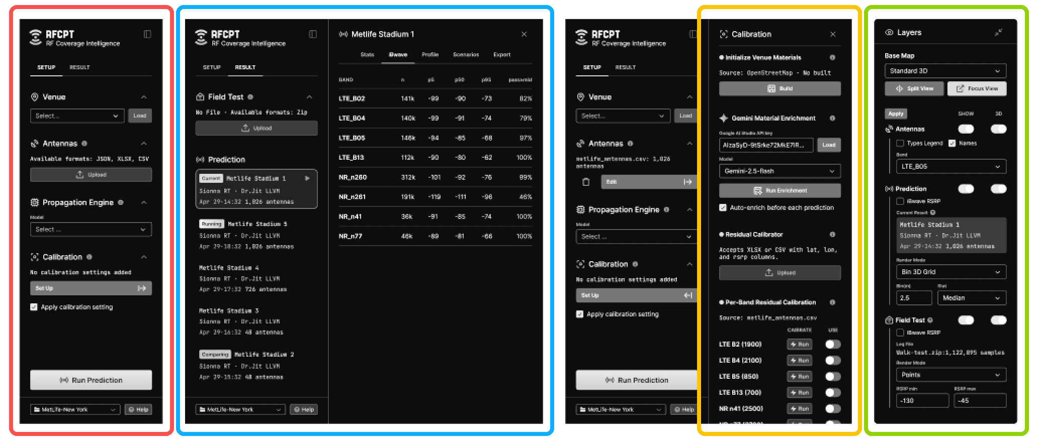
Use color + icon to distinguish information from different groups.
To further clarify the information structure, I assigned a distinct color to each information category to help users recognize the connections between them.
Configuration: Cyan

Prediction: Purple

Calibration Related Settings: Orange

Rendering-Related: Green

Progressive disclosure of information.
The original design had a very high information density, but users didn't need all of that information at all times. So in the redesign, I displayed information in stages based on the user flow, allowing users to focus on the task at hand.
Following the operational workflow, only the Configuration module is displayed by default on the initial page, while other modules are collapsed or hidden by default, and can be expanded as needed.
Before:
Configuration
Result Display
Render Setting

After:
Configuration
Result Display
Render Setting

Hide the explanatory text by default.
Before:
All explanatory text is expanded and displayed outside

After:
Explanatory text is hidden by default and only appears as a tooltip when hovering over the info icon.

Conditional expansion
Content sections expand dynamically based on user input or system state, reducing initial cognitive load and surfacing detail only when it's needed.

Future Steps
Adjusting the colors
I didn't have time to fine-tune the color palette, so I directly picked the background color from the original design. However, this bluish tone can be uncomfortable on the eyes over extended use. I'd like to test other neutral color combinations.
Run user tests on target users
I didn't have the resources or time to bring in RF engineers for real user testing. This design was based purely on my design experience — it helped me pass the design test, but whether it truly meets the needs of the target users still needs to be validated through further testing.